Thursday, 10 February 2011

What have you learnt from your audience feedback?

I got a mixed response from audience feedback. We posted our finished video onto youtube, but got no response from anybody, Just posting the video onto youtube was not enough so we needed to get it out more for people to see it. We decided that putting a link to the video on The Killers fan page would be a good idea as we could get feedback from real fans who obviously like the killers enough to use a forum about them.

Sarah made an account on the website and then posted this on their wall

The post got over 92 reviews but however only 2 people gave feedback It was not very detailed feedback however it was promising and positive, one saying "'Wow great video! Really! Good job.. Thanks for the post sarahdixonmedia!'. doing this also gave out youtube link more hits.


We also made a survey on a website called "Survey Monkey", we were recommended to do this by our teacher as it gives the responses from everyone who answered it in a clear and way to read way and is free to use, unless you want it to be presented in tables and graphs,then you have to pay. Using the free version you can make a questionnaire with up to 10 questions. We hoped that this would give us more specific feedback by asking people what we actually wanted them to answer, instead of leaving it open and them saying what they want. It is also anonymous so you don't know who has given you feedback


http://www.surveymonkey.com/s/HNR3DC5  Here is the link to our survey


Sarah then posted the link to our video and our survey monkey questionnaire onto her facebook page and sent messages out to some people that she knew, we then got some really positive and constructive feedback and with the help of survey monkey it was specific as to what we needed to hear. 50% of people gave our video 8/10 and the other 50% gave it 9/10 and people answers were very positive for example "I very much enjoyed the video, very easy to follow, but at the same time intriguing and unpredictable. It kept me in there".People also mentioned how the advert, digipack and music video clearly went together in a "package" and how they would be easily able to identify that they were all connected Other people also mentioned how they liked the storyline that went through the whole music video, not one person said they were disappointed as there was no performance. The only downside to this was that we knew the people giving the feedback and they may have been generous as to what they said, however as I said before SurveyMonkey is an anonymous website so we would not know who commented, they could say what they like and we would not know who it was.


The link on Sarah's facebook page


All in all I have learnt that it can be very hard to get constructive audience feedback. You need to get your video up in lots of places so lots of people see it and hopefully give feedback. With the use of facebook, youtube and survey monkey it has however made getting feedback easier, as it was not hard getting any of our feedback it just took time. I can imagine big company's get feedback very easily from facebook and websites as more people will view them and they willa lready be well known. I feel our audience did like our music video as the positive feedback we did receive was very promising, I feel that our audience like having a storyline throughout the video that they can follow, this was the main feature to our music.


In what ways does my media product develop or challenge forms and conventions of real media products?

Digipack and Advert

  • Our digipack and advert also use images related to the music video, this is too help make the digipack, advert and music video one package. The time code from the music video is also on the didpack linking it back to the music video
  • Lots of post-production was used on our product, just like we saw in other indie bands such as Yeasayer and the CD Sawdust by The Killers.We had to overlay the blue texture on the advert and digipack to give it the dark effect,we also added shadow to The Killers logo and to the name of the CD to help give it a gloomy feeling. The digipack can reflect the band and CD heavily, hence different bands have different styles of digipacks reflecting their music. That is why we gave ours a dark feel to it reflecting what the songs are actually about

The Killers and Yeasayer Digipacks

  • I wouldn't say our products challenge any conventions as in my opinion followed lots of them for our digipack and advert (as shown in top image). We linked all three of our products together to make them into a package so they stand out.


Music Video


These images show the main characters miming in my video and the video link above


  • In this Killers video http://sarahdixonmediablog.blogspot.com/2010/09/video-analysis-killers-smile-like-you.html it shows The lead singer as a ghost looking back at the past. We kind of did this in our video as the main character is having flashbacks throughout the interrogation scene. Also the lead singer from The Killers is shown as a ghostly character through the video, we tryed to include something like this in ours so we had the ghost of Jenny come in our video.


These images show the ghostly image of the lead singer from The Killers and the ghost of Jenny from our video


  • We found out in our research that Indie kids tend to where whatever clothes they want to, and found out that The Killers tend to where a suit. We decided that the main character in our video would where normal clothes, just to show him as a normal everyday person, the inspector wore a shirt and tie as we tried to incorporate a little bit of the suit look, we decided against him wearing a suit jacket and to roll up his shirt sleeves as the inspector is only shown in the investigation room and is trying to solve a murder, this could show him as a little stressed out and that he is trying to get comfortable, it also shows him to be more dominant than the main character. Jenny wore a dress to make her look feminine and vulnerable. You can see in the images above that the lead singer from The Killers wears a suit.

These images show Jenny's dress, The inspectors shirt and tie and the main characters casual t shirt


  • We also tried to do a ghostly effect on Jenny, we filmed her laughing and then added effects on premier to make her mover around the screen, a similar effect was used in The Killers, Smile Like You Mean It music video as shown in the ghostly picture of the lead singer above.


  • With reference to 'Dancing in the Distraction Factory' by Andrew Goodwin,  a convention in some music videos is the reference to looking ( a screen within a screen). We did this in our music video by adding a time code in the bottom left hand corner, this was to make it feel like you are watching CCTV footage and to give it a dark and sinister feel to it like you are watching a murder that you cannot stop. It is also to make the main character more vulnerable as the whole murder is on CCTV footage and the actual interrogation is being filmed by CCTV. 

How did you use new media technologies in the construction and research, planning and evaluation stages?

Here is a power point presentation showing all of the different technologies I have used throughout my project. These technologies have made it so much easier and even possible for me to do my project 


http://www.slideshare.net/secret/HV1cnvR9Qppxhh

Also another new technology that helped us lots was our mobile phones. These were very important as we used them to communicate with one another so that we could meet up to do our filming and editing, if we needed any help and just to see how everyone was doing with their projects. Without our mobile phones it would have been very difficult to meet up as we would have had to do it via land line or email , if anyone had a problem and was going to be late it could have messed up the whole filming.

How effective is the combination of your main product and ancillary texts?


Above is my Music video, digipack and advert package. I feel that if you look at them and watch the music video you can straight away tell that they are all connected.I feel that the work me and my group have done works very well and presents "the trilogy" in a great way. As they all seem to represent each other e.g the advert and digipack have the timecode from the music video on them, this will attract the audience to the CD.


  • Throughout the digipack, advert and music video lots of dark colours are used. in digipack and advert the blue texture overlay was commonly used linking the two together. The dark colours have been used to represent the dark goings on in the song " Jenny Was A Friend Of Mine". We also tried to create a spotlight sort of effect on the inside cover over the text. This is supposed to link to the interrogation room from the video with the spotlight going over them.  


These image show the use of the spotlight in the music video and the effect that we did on the inside cover of our digipack


  • The main image used on the digipack and advert show the main character crouched in the corner of a room, this is taken from the part of the music video towards then end where he is crouched on the floor because he has given up and the murder had unfolded, we also emphasised this by adding the time code onto the advert and digipack.

this image shows the main character crouched on the floor, similar to the advert and digipack.


  • The fonts used on the advert and the digipack are the same. For "The Killers" font we just used thier band logo, as for "the trilogy" we downloaded a font from dafont.com called "Times New Yorker". we felt this font fitted in perfectly as it looked like it was from a typewriter, linking to the interogation but also the font looked like it had run down, linking to the dark events that happen throughout "the trilogy"


  • I feel our products would attract both males and females. Our research showed us that Indie kids are both sexes but tend to be a little more male. We didn't want to attract just one sex so we tried to make the advert and digipack appeal to both using colours that would not be biased towards sexes, such as pink attracting females.
  • The most important people we wanted to attract was fans of The Killers. When Sarah posted the video on their website we got a few positive responses from some of The Killers fans which was very promising, we tried to do as much as we could to follow the conventions of Indie music and of The Killers to make it attract this group of people, one example is having the digipack and the advert very similar, if not the same
  • I think our products would attracts an age range of about 16-20, this is mainly to do with who acted in our music video. all the actors are 17/18 and I think that this would attract an audience of this age as they could relate to the people in the music video

Tuesday, 28 December 2010

Advert final

This is my groups final Advert design, based on the front cover of the digipack, as shown in my designs previosly.This was to follow conventions as The Killers do this with all of their digipacks and adverts. We did however choose a different image to make the advert with to make it look slightly different but you can still easily tell that they are linked. The Killers logo is on it aswell as the record label and when the album actually comes out, all common conventions. We used more layers in the top left hand corner to make it more dark giving a more sinister and dark feeling to the advert.

Digipack final

Front and back cover

This is my groups final digipack cover and it was made on Serif photo plus. Just like in the drafts of the front cover shown previously on my blog, we got the main character to sit in the corner of a room looking very weak and susceptible. This is helped by the high angle shot used when we took the picture stressing that he is a very weak and susceptible character. We tried to make it look like there was a light over him such as a spotlight and that he is being watched on CCTV (The little numbers in the left hand corner of the front cover). We used the Killers logo and there record labels, as well as a bar code on the digipack to follow conventions and like it is an actual killers digipack. The Killers logo looks almost 3D against the bluey background, we did this by lowering the opacity to make it more bright and stand out more and look ghostly, linking to the murder and Jenny. The font used for "the trilogy" has been done in a font called "Times New Yorker" and was downloaded from www.dafont.com. We chose this font as it looked like it was from a type writer, linking to the whole investigation scene.


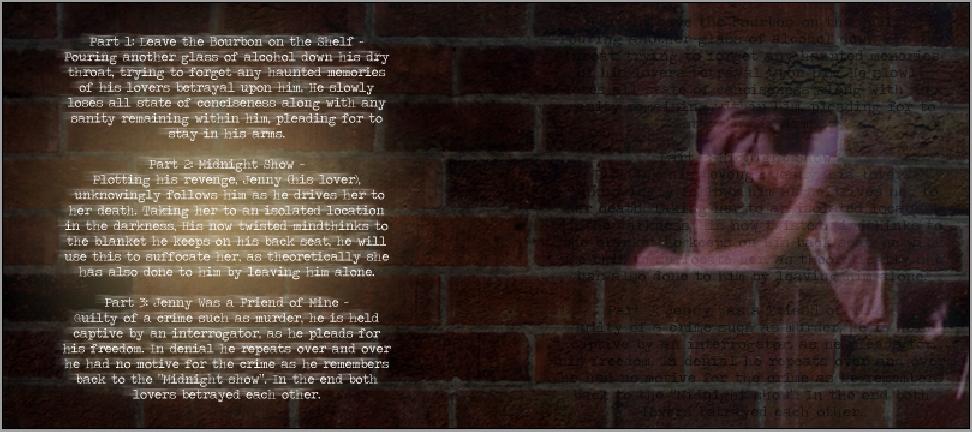
For the inside pages we chose to put a brick wall there linking to the main character being trapped and there is no escape as to what he has actually done. on the right hand side we put a picture of the main character but also some very faint font that blends in with him. This is supposed to be like a flashback in his memory and the text is the report written up of how he murdered his girlfriend, like it is haunting him. On the left hand side we put the track names and a description of each song, we used the "Times New Yorker" font again and used the same effacts as we did on "The Killers" logo on the front cover.


Inside the cover


http://tomsandersona2media.blogspot.com/2010/10/digipack-and-advert-design.html link to the designs

Monday, 15 November 2010

Shooting locations

For our video we needed 3 different locations for filming, a park, a promenade and an interrogation room. We chose our locations in the centre of York and at College so that all of our group could easilly get there. In the centre of York there are 2 big parks one called Rowntrees. Here are some images of Rowntrees Park


The other park is called The Museum Gardens
Location 1 is the image shown above


For the promenade we thought the shots would look really good next to the River Ouse. There are some nice locations just outside The Museum Gardens.

Location 2 is the image shown above

For practicality we decided The Musuem Gardens would be best as both the scenes we needed to film outside could be filmed there. For the interogation room we decided to use the green screen room at College


FILMING UPDATE

Filming took place on the 9th and 10th of November. On the 9th of November we went into the centre of York to get our outdoor shots in The Museum Gardens. We got all of our shots for the park Scene quickly and easily but when it came to getting the promenade shots we had problems. The river had recently flooded due to bad weather leaving lots of mud making it unsuitable for filming, however we did manage to find a place to do the shots very easily and once set up we encountered no problems. On the 10th we went to the green screen room in College and got the rest of the shots. We set up a table and 2 chairs in the corner of the room for the interrogator and the man. We also used a tape recorder and some pictures as other Mise-en-Scene. For some of the shots we wanted the actress playing Jenny to be wet, as in our video she was to be thrown in a river so she went in the shower at college in her acting clothes and then filmed. We also played around with spotlights in the green room to make sure that our footage was as we required. We yet again encountered no problems and it all went very smooth.


Location 1 is where we shot  for the park scene, Location 2 is where we shot for the promenade scene


Friday, 5 November 2010

Shooting Schedule


When it actually came to filming we had to make some changes to our Cast. Jess ended up being Jenny as Genie became unavailable, I took Jess's place and became the interrogator and then Richard took "the mans" place as Lewis also became unavailable.
 
Time
Activity
Location
Cast/Crew
Resources
D1 – 12.45
Meet in town
Museum Gardens
Jenny, Man.
All crew
Camera (Film and Photo)
D1- 12.50
Film flashbacks and take photos for props
Riverside, Museum gardens.
Jenny, Man.
All crew.
Camera (Film and Photo) – possibly watering can. Costumes, Props
D1 – 1.45
Return to college and print out the pictures for the next day.
-
Some crew.
Camera (photo)
D2 –
1pm
Arrive. Set up.
Green room
Crew.
Man, Interrogator, Jenny.
Camera(Film)
D2-1.15
Shoot interrogator and man’s scene
Green Room
Man, Interrogator
Costumes, Props, Camera(Film)
D2-2pm
Get photos of Jenny and get them printed.
Bathrooms / changing rooms.
Jenny.
Costumes, Camera(Photo)
D2-2.30
Shoot interrogator, man and jenny scene.
Green Room
Man, jenny, interrogator.
Costumes, Camera(Film)
D2-3.30
Get extra shots if needed.
Green Room
Man, Jenny, Interrogator.
Depends on what shots are needed


Research overview

My research has helped me understand lots of things about Indie music. Indie itself is a varied style and can be interpretted in different ways, for example the difference between the Arctic Monkeys music video Brainstorm is completely different to The Killers music video Mr Brightside. This could be to do with where the bands are from as The Killers are From Las Vegas and The Arctic Monkeys are from Sheffield, both bands obviosly having very different upbringings and could be reflected in thier music videos as the Mr Brightside video was very "flashy" compared to Brainstorm. Indie Fans seem to choose bands whoose music they like and then look up to them as sort of "role models", the bands having thier own style and do as they like and wear what they like. For the advert and digipacks in Indie music The Killers, Hurts and Bombay Bicycle Club all seem to keep both of thiers the same as shown in my research. Fans of The Killers seem to like this as shown by my interview answers. The music videos that The Killers do always have a storyline through them relating to the song and Fans seem to like this as also shown in my interview answers, however one did say that they would rather there be no perfomance. In order to appeal to fans of Indie music we will have to follow what The Killers do in order to create something similar so that thier fans will like our work.

Tuesday, 2 November 2010

Monday, 1 November 2010

Photoshop Digipack designs


Advert
Just like the Killers have done, we used the same images on the digipack and the advert so that it is more easily recognisable. We used a tool called "grunge" on photoshop to give the advert an aged and foggy look. We gave them both a  "dark feel" representing the song and the main characters state of mind. We used the Killers logo so that people can easily see that its the killers, however on the advert we had to change the colour of the logo to white instead of black so that you could see it more easily, wroking to our advantage as it looked good in white. "The trilogy" title was wrote in a font called "Times New Yorker" that we downloaded from a website called dafont.com. It is suppost to look like a typewriters font that has "leaked" down giving it a spooky/horror feel to it. The other font is just a standard typewriter font. We chose to use a typewriter font as it reflects the setting of our video, an interogation room. Typo "exclusave" should be "exclusive", will be change don final product.

Digipack
The images we used are from a photosharing website called flickr.com. we tryed to give it a dark and eerie feel, using photoshop to add effects to help us. The light coming in from the window is suppost to be a sort of "projector" effect, shining the writing up on the wall. On the inside there is a ghostly image of a female. This is suppost to represent Jenny from the song. We also used the "projector" effect on the inside of the digipack with the song list and storyline. Yet again the Killers logo is on there and we used a typewriter font, reflecting the interogation room.

Sunday, 3 October 2010

The trilogy lyrics- Jenny was a friend of mine

Jenny Was A Friend Of Mine
We took a walk that night, but it wasn't the same
We had a fight on the promenade out in the rain
She said she loved me, but she had somewhere to go
She couldn't scream while I held I close
I swore I'd never let her go
Tell me what you wanna know
Oh come on, oh come on, oh come on
There ain't no motive for this crime
Jenny was a friend of mine
So come on, oh come on, oh come on

I know my rights, I've been here all day and it's time
For me to go, so let me know if it's alright
I just can't take this, I swear I told you the truth
She couldn't scream while I held I close
I swore I'd never let her go

Tell me what you wanna know
Oh come on, oh come on, oh come on
And then you whisper in my ear
I know what you're doing here
So come on, oh come on, oh come on
There ain't no motive for this crime
Jenny was a friend of mine
Oh come on, oh come on, oh come on


I believe in this song he is being interrogated by police. The first verse he is lying to them, and what they were up to that night saying "we took a walk late that night, but it wasn't the same, we had a fight on the promenade out in the rain". He trys to make it out to the police that he does not know where she has gone and trys to make himself feel better by saying "she said she loved me, but she had somewhere to go". "There ain't no motive for this crime
Jenny was a friend of mine" He is trying to tell them that he had no reason to kill her as she was his friend and repeats " oh come one" because he wants them to believe him. In the second verse I believe he is about to crack and has ran out of things to say so starts arguing with the investigators "I just can't take this, I swear I told you the truth". In the third verse I believe the person questioning him says "I know what you're doing here" meaning he knows that he killed Jenny. He then cracks and goes crazy repeating how she was a friend and how he wouldnt kill her and repeating "oh come on" 

The trilogy lyrics- Midnight Show

Midnight Show
I know what you want
I wanna take you a midnight show tonight
If you can keep a secret
I got a blanket in the back seat of my mind
And a little place that sits beneath the sky
She turned her face to speak
But no-one heard her cry
I drive faster, boy
I drive faster, boy

I know there's a hope
There's too many people trying to help me cope
You got a real short skirt
I wanna look up, look up, look up, yeah yeah

We were just in time
Let me take a little more off your mind
There's something in my head
Somewhere in the back said
We were just a good thing
We were such a good thing

Make it go away without a word
But promise me you'll stay
...
Oh make it go away!

I drive faster, boy
I drive faster, boy

Oh crashing time can't hide a guilty girl
With jealous hearts that start with blossom curls
I took my baby's breath beneath the chandelier
Of stars in atmosphere
And watch her disappear
Into the midnight show...

Oh faster, faster, faster...
Oh no no no no no...
If you keep a secret
Well baby... you can keep a secret
If you keep a secret...


I believe the first verse of this song is talking about the location of the murder."I know what you want" meaning that he knows Jenny does not want to be with him and break up with him, but "I wanna take you a midnight show tonight", the "midnight show" being the actual murder. "If you can keep a secret"is being ironic as when she is dead she is not actually going to be able to tell anyone what happened. " she turned her face to speak
but no-one heard her cry I drive faster, boy I drive faster, boy " I believe this is the actual murder and he says no one heard her scream when he kills her and then he has to drive away fast to get away from the scene of the murder. I believe in the rest of the song he is going more and more insane and has actually realised what he has done and trys to reassure himself that no body will find out what happened "Oh faster, faster, faster...Oh no no no no no...If you keep a secret Well baby... you can keep a secret If you keep a secret..."

The trilogy lyrics- Leave the bourbon on the shelf

Leave the bourbon on the shelf
Shakin' like the Devil when she lets me go
Got a new place, and how it's so much better
Falling over myself, the televisions' on,
I turn it off and smile
Oh, Jennifer, you know I always tried
Before you say goodbye

Leave the bourbon on the shelf
And I'll drink it by myself
And I love you endlessly,
Darling don't you see I'm not satisfied
Until I hold you tight
Give me one more chance tonight
And I swear I'll make it right
But you ain't got time for this
And that wreckin' bell is ringin'
And I'm not satisfied
Until I hold you

Jennifer, tell me where I stand
And who's that boy holdin' your hand?
Oh, Jennifer, you know I always tried
Before you say goodbye

Leave the bourbon on the shelf
And I'll drink it by myself
And I never liked your hair or those people that you lie with
But I'm not satisfied
Until I hold you tight
And I love you endlessly,
Darling don't you see I can't be satisfied
Until I hold you tight

Leave the bourbon on the shelf
And I'll drink it by myself
And I love you endlessly,
Darling don't you see
I'm not satisfied 


From these lyrics I can make out that the main character has caught or suspected his girlfriend cheating on him. You can tell he gets angry because it starts with "shakin' like the Devil when she lets me go". Brandon ( the lead singer) sounds very depressed when he sings the last few lines of the song and its like the main character is in denial of what has happened, "im not satisfied". The main character I believe has also turned to alcohol to comfort himself. He trys to make himself feel better by insulting her hair and the people that she likes. Also the "shakin' like the Devil when she lets me go" could refer to him not having enough alcohol in his system and gets the "shakes".

Saturday, 25 September 2010

Interview answers

1) I really like Brandons voice and the lyrics to thier songs. I like thier style and the way that they dress aswell as the music that they produce. I feel that they are a little different to other Indie bands as they include other instruments such as synth.

2) My favourite is Mr Brightside. It is set in the past and shows them performing to an audience. It also cuts to relevent scenes to do with the lyrics. I would like to see a video though that is just like a story all the way through because while the band are performing on the video I feel they could use the tiime instead to create more of a story.

3) The album art is kept very simple and I believe this works. They all have the same font on them but just a different picture in the background. I can immediately tell that it is the killers and I like how it makes a collection.

4) Indie music influences me lots in my everyday life. my fashion is based around the members of the bands as I try and wear similar clothers to them. I like the whole "Indie attidute" and how they are seena s non conformists.I would love to be in a Indie band as the band members make it look very desireable.

5)The fact that the members are mainly young I feel I can relate to them. I like how you can go see the music live with a good atmosphere, have a few drinks and a good laugh with your mates while listening to really well wrote music.

6) I only really listen to Indie music but my other faveourite Indie band is most probably the Arctic Monkeys. i love thier music videos as they are always relevent to the song and tell a story, not always interly in a "sain" way for example in one video they had clowns fighting in it. The Arctic monkeys album art seems to relate to the Indie lifestyle like on one of thier viedos they are all sat in a room smoking and drinking, havinga  good time. The killers album art is different as it relates more to the name of the album like the album Day and Age. There is a background picture of a nightime scene with a moon

Here are the answers that other people gave
http://sarahdixonmediablog.blogspot.com/2010/10/audience-research.html
http://jesslambert1992-a2musicvideoproject.blogspot.com/2010/09/audience-primary-research-interview.html

Interviews

As a group we came up with some interview questions to ask some big Killers fans, as all of us knew of someone who really liked them

1) What do you like about the killers in general?

2) What do you like about the killers music videos and what do you look for?

3) What do you like about the killers album art and adverts, what do you look for?

4) How does Indie music influence you?

5) What attracts you to Indie music?

6) What other bands do you listen too in this genre? and how would you compare thier music videos and album art to the killers?

Questions 1,2 and 3 will help us because it will help us find out what fans of the killers actually like about thier album art and music videos that we could try and include in our music videos or even challenge. Questions 4 and 5 will give us a greater knowledge of "Indie kids" and why they are attracted to the genre of music. Question 5 will help us try and include things that other bands may do that Killers fans are attracted to and may even wish the Killers would include.

Friday, 24 September 2010

Digipack and advert analysis


Sawdust is an album by The Killers, The Advert and the digipak are the same, This is done so that people will easily be able to recognise the album once the have seen the advert. The photograph in the background is relevent to the name of the CD as it is taken in a forest where trees grow and has an arm in the scene that has been edited to look like a log and then edited into the picture. This is relevent because sawdust comes from trees. The colours used are just typical colours in a forest eg browns and greens, This is also just relating to the name of the album. This is the same all through the digipak when you open it up.The font used that says "The Killers" is used on all of the Killers albums so that the fans can easily recognise it and the "sawdust" title is wrote using  7 segment display font, this coputerised style seems very popular in Indie Music. The layout for both of these has been kept very simple with the bands name and name of the album in the middle. This is very common with The Killers digipaks and other Indie bands. The advert differes however because at the bottom it gives a little bit of information about when it is going to be released and where you can purchase it from.

Thursday, 23 September 2010

Day and Age is another album by The Killers. The advert and album art are yet again the same, this seems to be common.Just like in sawdust the album art is relevant to the name of the CD. The background is in a mosaic sort of style night time image with shrubs and trees at the bottom. I think the shrubs and trees at the bottom are there because the album is carrying on from the previous album "Sawdust" and on that album art there are lots of trees. The colours used are that typical of a night time scene for example purples,blacks and whites. "The Killers" font is used again on both the digipack and advert, another common feature with the killers. The layout is yet again very simple for the both of them with "The Killers" in the middle and "Day and Age" underneath it. On the advert it also mentions one of their popular songs, I guess to try and help sell it, as well as having their website and record label.

Here are the links to others we did as a group
http://sarahdixonmediablog.blogspot.com/2010/09/digpak-research.html